
Logo!
Decatur Metro | August 11, 2009Yesterday, Decatur Metro was just an idea; a bodiless web address displayed in a weird, italicized, default font tucked in the corner of the page.
But TODAY, thanks to Lauren Lee, Marcia Lampe and all the great folks at Lampe-Farley Communications, Decatur Metro is now a bold and exciting logo!
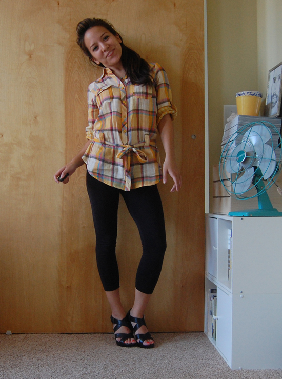
Here’s a pic of Lauren thinking about how awesome her logo design is.
We’re still tweaking the size and position, but I’m loving it. Loving it so much that I’m going to plaster it on everything! T-shirts with preachy and/or snarky comments, car windshields, your cats and dogs, AJC newspaper boxes, other websites! The annoying marketing possibilities are limitless! Drool…


I’ll take two kitty tags, please!
Aww thanks for the shout out, DM! We had a great time working on your logo! Lampe-Farley staffers will order DM mugs and the AsianCajuns will take two DM jumpsuits.
Love Lauren (and Cath) and their blog and love the new logo! Congrats.
The logo looks great. My feedback for the site would be to cut the space under the logo and above the nav bar down, and maybe to find a way to cut down on the empty space up top a little.
Absolutely Rusty. The logo needs to be shrunk down a bit and white space above and below the logo needs to be minimized. We’re workin’ on it! Thanks for the feedback!
But what is ecatur etro? Logo doesn’t scan properly.
Uh-oh, Rusty and DM, watch out with dictating design. Watch this video about clients who want to “eliminate their white space” and say “make my logo bigger.”
Nice. I totally agree there should be some white space, or else you’ve got 11 Alive’s web site. Just saying it shouldn’t be there unless there’s a reason for it to be there.
Love the logo. Love the blog.
Looks good!
Hey, I want one those hardhats with beer holders and straws attached.
Love it!!
I like the colors. I’m reminded of “Ghostwriter” and Nickelodeon on account of the “splat.”
Am I completely out of bounds by saying Lauren is…well…kinda hot?
Oh my! I admired the new logo this morning but had no idea it was by LL and the LF’s. Nicely done.
Nice smatter and hot girl you’ve got there but isn’t courier a bit generic, given that it’s a default typeface on nearly every computer platform? Monospace, and especially courier is more cliche than newsy now, though that’s just my opinion and playing devils advocate.Though don’t listen to me because I’m the guy that cleared chick-fil-a of all the Texas Pete, and caused that big stain at the nearby dumpster, and I’ve not been well since. Otherwise awesome logo, and a major improvement, and praiseworthy.
I’m all about cliche. The more cliche the better!…especially when it upsets font nerds.
Not a font nerd, nor do I think that logo is cliche. Just think it’s risky using default fonts that come on every pc and mac in a logo. It’s either lazy, crazy, gutsy, or a creative statement. If the client is happy then it was a good risk. It’s one of the few fonts on my windows 98, and I use it because all the characters are the monospace/same width, which works better on my dot matrix printer. so I recognized it right away. Maybe it does have a little bit of “by the people for the people”, not talking down kind of statement. If that was the intention then it seems good
Looks like you’re one step closer to corporate sponsorship and eventual franchising! way to go!