In recent years, both home design and fashion have embraced a form of understated elegance characterized by muted colors, soft materials, and subtly impressive design elements. Yet, what if tranquility isn’t solely found in the absence of color but rather in its plentiful presence? A vibrant residence in Long Island showcases a different paradigm: adopting joy and vivid colors as fundamental design elements.
Perched on a hill and enclosed by mature trees, this 12,000-square-foot modern residence was initially designed with minimalism in mind. It featured clean, crisp lines and a predominantly white interior that echoed the then-popular trend of minimalistic restraint. However, for the home’s owners—a dynamic family with deep ties to New York’s cultural scene—this neutrality was more stifling than soothing. They desired a home that emanated joy and vibrancy.
Why the 12-5-30 Incline Walking Method Is the Ultimate Fat-Burning Workout, According to Fitness Experts
The ultimate trick to banish mold from your bathroom grout in just 7 minutes—no vinegar or baking soda needed
Given a blank slate and unlimited creative liberty, Shanna Gatanis Design Studio adopted a bold approach, transforming the austere space into an exuberant and vibrant setting that still offers a sense of restoration. The outcome is a calculated yet joyful ambiance, proving that joy can be as stabilizing as serenity.
Vivid colors uplift and can significantly influence mood changes. In this context, color transcends mere decorative purposes, serving instead as an emotional foundation and a mechanism for resilience. This philosophy permeates every corner of the home.
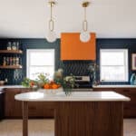
The color scheme draws inspiration from 1990s hip-hop culture, vintage sports imagery, and the dynamic hues of a recycled Nike sneaker floor, which served as an unexpected inspiration for the project. Blues provide a foundational depth and continuity throughout the home, while intense reds, yellows, and greens flow through the rooms, creating energetic visual rhythms that invigorate without overwhelming.
This home boldly counters “chromophobia”—the subtle societal fear of color that has long influenced perceptions of taste. Instead, it embraces color’s ability to reflect mood, enhance joy, and even encourage interaction.
The house maintains a careful balance between vibrancy and excess through its intelligent use of materials. Warm woods, terrazzo, colored glass, and polished surfaces add layers of texture, while translucent fabrics and rounded, 1970s-inspired shapes temper the overall intensity. The result is an environment that is engaging yet suitable for everyday life.
Functionally, the residence is designed as both a sanctuary and a playful space. Open areas for entertainment transition into more private family spaces, while features such as a basketball court, music lounge, pools, and a versatile outdoor room expand the concept of home into an immersive experience.
Throughout the home, delightful details abound. For instance, a Lego-inspired fireplace serves as a striking sculptural element, and a graffiti mural blends Brooklyn, Biggie Smalls, and basketball into a visual ode to the family’s heritage. These playful touches, while whimsical, are significant expressions of identity, memory, and belonging.
Ultimately, the personal stories embedded within this project elevate it from mere spectacle to a vibrant personal narrative. Perhaps tranquility is not always about silencing the chaos but embracing the world in its full, vivid spectrum. Achieving this requires embracing and enhancing color saturation.
Photography courtesy of nickjohnsoninteriors.com.
Similar Posts
- Revolutionize Your Walls: Karim Rashid’s Bold Wallpaper Capsule Transforms Interiors!
- 2025’s Best Interior Design Trends: Top 10 Must-See Posts!
- Vibrant Tuscan Colors Revolutionize Ontario Home: Inside Studio Brocca’s Stunning Transformation
- F5: Tina Ramchandani Talks Figaro the Dog, Vibrant Colors & Floral Fascinations!
- CLB Architects Craft Stunning Multigenerational Mountain Home: A Masterpiece in Wyoming!

Hi, I’m Michael from the Decatur Metro team. I offer you practical tips to enhance your living space.