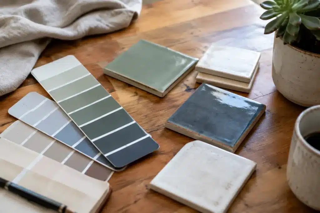
Each autumn, designers and manufacturers turn their gaze toward the coming year, asking which hues and aesthetic directions will dominate interiors, architecture, fashion, and product design. Paint companies encapsulate these forecasts in their annual Color of the Year choices, which reflect shifting cultural moods, aesthetic trends, and how people want their environments to feel.
These yearly picks do more than predict; they often shape broader trends. Over time, Colors of the Year influence palettes used across fields—from furniture and textiles to building finishes and consumer goods—and together the selections reveal larger movements in taste and lifestyle. For 2027, many brands gravitate toward greens, earthy browns, and softened blues, signaling an ongoing appetite for nature-rooted, comforting, and lived-in interiors. Below is a closer look at this year’s standout shades, the ideas behind them, and what they suggest about design priorities ahead.
Cottage Door by Valspar
Valspar’s Cottage Door channels the tactile charm of natural materials, offering a subdued blue that feels familiar and welcoming. Rather than chasing seasonal fads, this hue aims to harmonize with the shifting tones found in nature, lending rooms a quiet, authentic character. Its restrained quality celebrates imperfection and the small, personal traces that make a space feel like home.
Why a Simple Mistake in Your Online Pension Application Could Cost You Your Retirement Benefits
The ultimate trick to banish mold from your bathroom grout in just 7 minutes—no vinegar or baking soda needed
Learn more about Cottage Door here.
Grounded by Behr
Behr’s 2027 selection, Grounded, reaches for the outdoors by blending olive-green notes with warm brown undertones. The result is a stabilizing shade that narrows the divide between interior spaces and the natural world, turning rooms into calming, nature-inspired retreats.
Learn more about Grounded here.
Celery by Sherwin-Williams
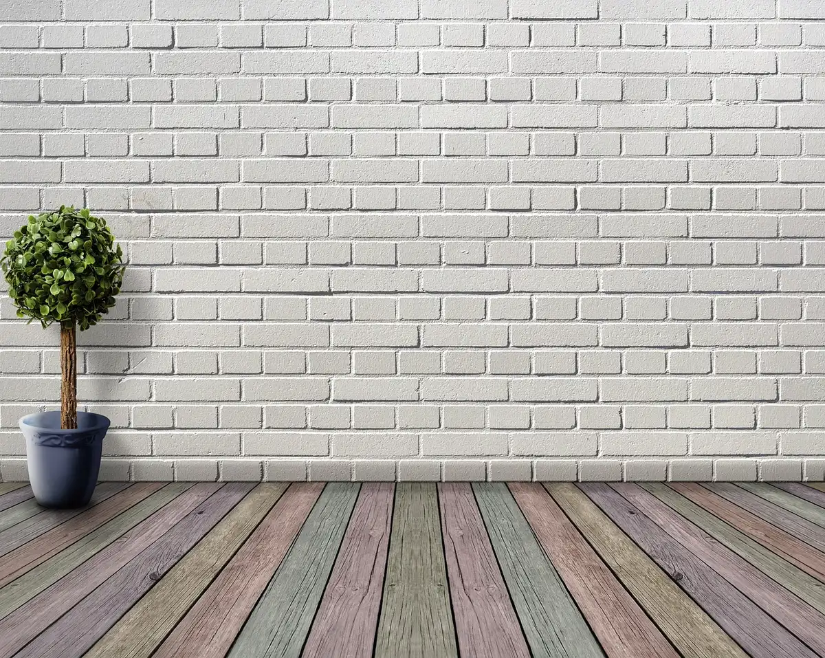
Sherwin-Williams’ Celery brings a light, pastel green into interiors, suggesting a soft equilibrium between serenity and vitality. Its refreshing, airy tone supports both subtle backgrounds and bolder accents, reinforcing the connection between thoughtful color choices and wellbeing in the home.
Learn more about Celery here.
Webster Green by Benjamin Moore
Benjamin Moore’s Webster Green strikes a balance between time-honored elegance and contemporary sensibilities. This refined green carries a classic feel while remaining adaptable to modern settings, adding depth and personality without overwhelming a room.
Learn more about Webster Green here.
Artifact by Glidden
Glidden’s Artifact is a muted aqua that quietly revitalizes interiors without requiring major renovation. As a gentle alternative to stark white minimalism, it preserves simplicity while introducing a soft veil of color that allows personal style to shine.
Marle by Little Greene
Little Greene chose Marle for its 2027 highlight, a subdued brown that echoes the renewed interest in earthy tones across fashion and interiors. The brand describes it as both luxurious and relaxed—a hue that brings warmth and a grounded sense of comfort to surrounding surfaces.
Quiet Peace by California Paints
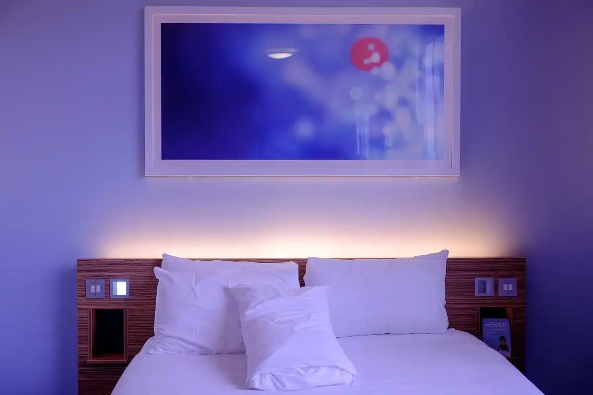
Quiet Peace from California Paints is a deep, contemplative blue intended to foster calm and reflection. It encourages mindful living by creating spaces that feel intentional and restorative, offering a refuge from the pace and noise of daily life.
French Press Coffee by Dunn-Edwards
Dunn-Edwards’ French Press Coffee predicts a move toward desaturated, atmospheric browns in the coming year. This smooth, rich tone evokes a sense of history and quiet luxury, creating intimate, warm interiors with a sophisticated edge.
Deep Rooted by Dutch Boy Paints
As its name implies, Deep Rooted from Dutch Boy Paints aims to cultivate a sense of authenticity and steadiness. The terracotta-based hue, with its warm undertones, supports the trend toward personalized, comfortably worn-in environments.
Vantage Point by Clark+Kensington
Clark+Kensington’s Vantage Point is a clear, invigorating blue that lifts everyday rooms with a fresh, optimistic energy. It’s a color designed to refresh the look and mood of domestic spaces.
Rose Earth by Graham & Brown
Graham & Brown’s Rose Earth draws inspiration from the mineral pigments of Italian clays, connecting modern interiors to historical artistry. The soft pink carries a warm terracotta base that lends contemporary spaces an artisanal, rooted quality.
Pueblo by C2
C2’s Pueblo explores the idea of spaces that engage and energize, rather than simply provide escape. With its earthy pink and mauve undertones, Pueblo encourages tactile interaction and active use of interiors—turning them into environments where people feel lively and involved.
Similar Posts
- Valspar Declares Blue the New Neutral: Discover the 2027 Color of the Year!
- Emerald Depths Unveiled: Behr Announces 2027’s Captivating Color of the Year!
- Benjamin Moore names green its 2027 color of the year
- Sherwin-Williams picks paler green as its signature hue for 2027
- Kohler launches Fleurette Artist Editions collection in collaboration with Aerin Lauder

Hi, I’m Michael from the Decatur Metro team. I offer you practical tips to enhance your living space.