
How Would You Improve Decatur’s Wayfinding System?
Decatur Metro | January 31, 2012 | 11:30 amThere’s been a lot of commentary about Decatur’s wayfinding signs around the city since they were installed a couple years ago.
A lot of it has been about the “look” and placement of the signs themselves, but not much has been said about the overall effectiveness of the program itself.
As a recent post on the Atlantic Cities blog notes, creating a successful wayfinding system is actually quite complex to implement properly.
“Architectural signage and wayfinding isn’t about building a nicely designed sign,” says Sue Labouvie, one such expert whom we tapped to explain the science of helping us find our way in the city. “It’s about the information content and the analysis of the space or place that you’re trying to move people through, and coming up with a strategy of how you make this big complex thing simple and understandable to the user.”
How do you clarify to people what a city is about, how they should move through it and where they can find all the really important stuff? Or, put another way: How does a city do this, all on its own, so that I don’t have to ask a knowledgeable-seeming stranger on the street for directions?
Philadelphia divided its downtown into five different color-coded sections on their street maps. New Orleans signage allows for multiple lines of text to describe a destination.
With that in mind, how successful do you believe Decatur’s wayfinding system has been? And more importantly if you see room for improvement, what could be done to build off of Decatur’s current wayfinding signage?
Are there urban elements of Decatur that are still intuitive to the average pedestrian? We don’t have a church at the top of a hill, but we have the Old Courthouse. Would color-coding the city help visitors find their way around? Should chosen destinations have more prominent signage of their own?
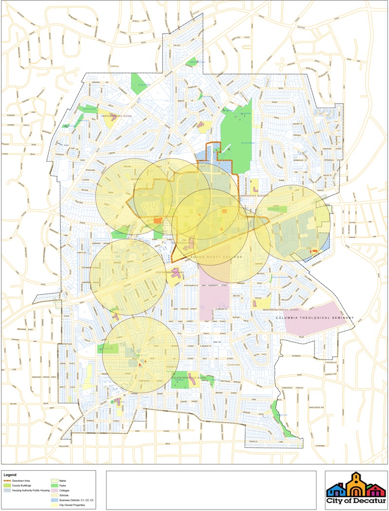
Photo courtesy of City of Decatur’s website
Related Posts:
-
 April 17, 2015 Eye on the Street (3)
-
 April 21, 2015 UPDATED: Tree Falls on City Garbage Truck; No One Hurt (12)
-
 April 28, 2015 DeKalb, PATH and CSX Negotiating to Close Stone Mountain Trail Gap Over I-285 (3)


Honestly? This may sound silly, but I think the color and the design are pretty bad and not eye-friendly enough.
I would agree. Maybe a case of ‘form not following function’ — almost as if the purpose of the signage was secondary and the artistic appeal was the primary reason.
One specific suggestion would be to follow the oft used European approach for signage related to public parking: place BIG blue signs around town with a simple large white “P” on them, and maybe “Parking” in smaller type below.
I suspect that the most important thing people are looking for in Decatur is parking, and the signs do a lousy job in that regard. Related to that, once you find parking (in lots/decks) it’s difficult to figure out what it costs or when/if it’s free.
Also I wish the lamps on the signs lit up.
No problem with current signage. As Bo suggested, perhaps we could improve our signage for parking on the square. Something like the neon signage used at Atlantic Station could be nice. Super-visible but not gaudy. http://imgur.com/9nss7
They advertise a cathouse, but I do not find the cathouse? http://imgur.com/EHz4W
And I’m pretty sure that D-town is either Dallas or Detroit.
That sign in particular is one that should be moved. It’s steppin’ all over that street tree’s roots.
And on another sign in that pic, how many years has that Developer Closeout been going on at the Artisan?
That photo is from 5/09, so the closeout has been going on quite a while!
The abbreviations on the signs have always been my chief complaint. You could bring the font size down a tad and get the whole word on there. The abbreviations are confusing and childish.
Actually, I love them. They lead and guide me around.
They are terrible. Hard to read. Specifically:
-The “bars” between lines serve no purpose except to distract the eye.
-The triangles are not directional enough; an arrow would be much more effective.
-Agree with SteveC about parking.
Very difficult question to answer because I already know where things are in Decatur. However, the question I am most frequently get asked is “Where is the Courthouse?” And I always get the impression that the asker has been directed to the Old Courthouse on the Square, when they are actually asking about the DeKalb County Courthouse.
Like Parker, I know where everything is and so it’s not easy to think in terms of where the signs are placed and which places they call out. However — and this may surprise some people — I do have strong opinions about the design:
— The arrows are not directional enough, to the extent of making the whole thing look like a list of bullet points.
— The choice of font was unwise.
— The whole thing is too much about architecture and not enough about pointing the way. The sign-topper (Decatur’s little signature row of buildings) is way too big in proportion to the part that is supposed to convey meaning (the panels with the words). Together with the lamp, it makes the whole assemblage difficult to interpret at a glance.
Like others have said, it’s hard for me to judge because I already know where everything is and don’t pay too much attention to the signs. I do like the idea of the look of the signs, but it could be better executed. They need a much better font because frankly, the one they chose looks childish and annoys me almost as much as Comic Sans. And I completely agree with Smalltowngal – the “arrows” really look like bullet points. Especially in the first pic posted when they’re all pointing the same direction.
I suppose I feel like there need to be more directional signs near the courthouse and MARTA station. Maybe there are some there that I just haven’t noticed, but when I cut through the square by the MARTA station to get to church street, I usually get stopped by someone there looking for directions (most of them usually to the courthouse, the library or Agnes Scott). The placement could be so much more effective.
+1 NO ONE seems to be able to find their way to the court house.
Atlanta’s signs for comparison: http://imgur.com/a/3AuNR
Their arrows are much clearer.
Font is more readable, too.
lol at “SoNo district”
South of North – SoNo
Agree that the triangle bullet symbol is not an arrow. It is much harder to distinguish directionality from a tilted triangle than from an arrow with a tail. What is the name for those ▲symbols (am trying to display with Alt 30 on the number pad)? I’ve heard people at work call them carets but I see that a caret is really this symbol: ^.
I’m ok with the signs otherwise if they had real arrows pointing the way.
They are ugly. They are bland. They are invisible from their surroundings. They are confusing. Other than all that…
So unhappy about the waste of resources for these signs. The abbreviations are crazy. The top of the signs should light up if they have a doggone light. I agree that most people are looking for either the Decatur City Hall, Police station or the DeKalb County Courthouse, and those directions should be clear and explicit. And by the way, while we’re complaining about design, I’m really over the Stargate design of the MARTA pavillion. Really?
I’d place the “Thanks for Visiting” sign closer to Decatur’s actual eastern border on Ponce to better represent and incorporate all neighborhoods within city limits.
.
Too funny. Where is it actually placed? That could be disconcerting, driving to your Decatur residence and passing a ‘Thanks for visiting” sign, wondering if your area has been–what’s the opposite of annexed?–unannexed? Outexed? Abnexed?
Can’t recall the exact location, but it’s placed well before drivers reach Sycamore St / Sycamore Dr.
I am a Wayfinding consultant and have been doing this for over twenty years. I’m sorry to say that the Decatur wayfinding is so dreadfully poor for all the reasons stated. Decatur deserves better.
The thing that I would like to see is an improved parking deck – the one by the “new” courthouse. It needs some color, it needs to be more inviting, and it needs better signage. I think that most visitors don’t think it is open to the public.
You can talk to DeKalb County about that – it’s their deck.
Yes, Steve, but who with the city is nudging them along to make improvements?
+1 for painting, inviting … If it is to be seriously considered for overflow or Square parking: lighting, plantings, beautification of it and the surrounding area. Though, I realize it doesn’t belong to COD
+1… and have you ever tried to find your way out of there after not parking there in a while? The Exit directions are either missing, illlegible or poorly placed.
…or after too many pints and flights at Mac McGee’s!
+1. To borrow another DMer’s response on a previous topic, “I know not of what you speak.”
I believe you. No, really, I do!
A progressive town like Decatur should be taking down signs, not putting them up. Especially in an era where GPS devices proliferate in cars and on phones.
http://www.theatlantic.com/magazine/archive/2008/07/distracting-miss-daisy/6873/
They are out of scale, clunky, and overly nostalgic.
And since when do lamps sit on top of bungalow columns? Seems a little hokey and contrived.
I agree about the arrows.
+1
Overly nostalgic. Simple straightforward design would have been better.
The Decatur wayfinding signs are really ugly. Just curious what city group ultimately approved these for construction and placement?
The signs are fine. Like TeeRuss said, they are almost obsolete and redundant now anyway. They will be nothing but anachronisms in a few short years.
HOWEVER, if we are going to fix them, I’m willing to earmark a few of my tax dollars to exercise eminent domain and replace the Adair Oaks Apartments signage. I cannot drive down Adair without my OCD flaring up and making me itch all over when I pass the South Entrance sign, which is directly north of the North Entrance sign, or vice versa. Seriously, am I the only one bothered by this? Or the only one to even notice???
It’s a quirk. I find it gives me something to think about besides fretting over how much of my precious time remaining on this earth I’m about to spend at the post office.
Wow, never noticed. I’m going to drive by and get bothered too. I’m still bothered by the fact that local voting precinct Clairemont East is WEST of Clairemont West and vice versa. I still think that having the entrance to the PO driveway located on the left hand side of the front of the PO is against the natural order of things but have accepted the logistical reasons it is that way.
I can tell you what the signs have done for me.
I never call the city Decatur anymore. I call it what the signs call it
D’Town.
Say it with me, now. D’Town. We’re all going to D’Town. Yeah, I’m from D’Town.
D’Town.
That’s hilarious. I’m going to buy Cthotchka in D’town. Let the other people call it downtown.
Change the abbreviation for “courthouse.” It is so bizarre I cannot even remember it right now, but it never makes me think of a courthouse.
That would be the cathouse that strixxvaria has been searching for.